")
Creating great content isn’t enough anymore—it has to look the part, too. On fast-moving platforms like Instagram and Facebook, your visuals are what get you noticed, remembered, and clicked.
In over 9 years of designing for performance-driven social media campaigns, I’ve seen a clear pattern: brands with strong visual content consistently win more attention and engagement. And you don’t need a design degree or a full creative team to get there.
In this post, I’ll break down:
- Why visuals matter so much on Instagram and Facebook
- What makes a design stand out in crowded feeds
- Tips to design content that aligns with your brand and goals
- Visual formats that perform best (and when to use each)
- Tools that make the visual process easier and faster
Let’s turn your feed into a scroll-stopping machine—without overcomplicating the process.
1. Why Visuals Drive Social Performance
Social media is a visual-first environment. If your image doesn’t capture attention instantly, the rest of your message doesn’t stand a chance.
Here’s what strong visuals do for your content:
- Capture attention in under three seconds
- Communicate your message before they read the caption
- Establish visual identity that builds brand recognition
- Drive actions like saves, clicks, shares, and follows
If your visuals aren’t doing that, they’re just decoration. You need design that works. If you’re unsure where to begin, check out my guide on designing content that actually converts.
2. Stick to Visual Consistency—But Stay Fresh

Consistency helps build trust. But sameness can lead to boredom. You need a visual rhythm—recognizable yet varied.
Here’s how I do it:
- Use 2–3 main brand colors across all posts
- Stick to 1–2 fonts, but alternate sizes and spacing for variety
- Create post templates that allow easy content swaps
- Mix photo-based posts with illustrated or text-only visuals
A strong design system is the foundation. Learn how to build one in my post on brand consistency in social designs.
3. Format Your Visuals for the Feed
Instagram and Facebook favor different behaviors, but both demand visuals that are mobile-first and attention-friendly.
Use these specs as a baseline:
| Post Type | Optimal Size | Usage |
| Feed Image | 1080×1080 (1:1) | Quotes, announcements, promos |
| Carousel Slide | 1080×1080 or 1350×1080 | Tutorials, product showcases |
| Story/Reel | 1080×1920 (9:16) | Behind-the-scenes, quick tips |
| Video Thumbnail | 1080×1080 or 1280×720 | Cover text, bold color overlay |
Poor formatting can make even great content look unprofessional. For more design layout support, explore my post on layout, color, and typography.
4. Use Visual Hierarchy to Guide the Viewer

Hierarchy isn’t about “design rules.” It’s about making sure the viewer sees what matters first.
Every post should have:
- A primary focal point (headline, image, offer)
- Secondary supporting text (subhead or bullet points)
- A visual path that leads to the CTA or final thought
Tips that work:
- Use size and color contrast to create focus
- Stick to 1–2 fonts with intentional weight differences
- Leave breathing room—don’t pack too much into one graphic
If your eye doesn’t know where to land, neither will your audience’s.
5. Match Visual Style With Content Purpose
Not every design needs to be bold or loud. Some posts work better with a minimal approach, others need high energy.
Choose your style based on your content goals:
| Content Type | Best Visual Style |
| Product Promotion | Bold colors, contrast, big CTA buttons |
| Education/How-To | Carousel, icons, clear labels |
| Quotes/Statements | Text-focused with branded background |
| Testimonials | Customer photo + styled text overlay |
| Behind-the-scenes | Natural photos with subtle branding |
And yes, the “style” should still align with your brand. If your tone is playful, make sure your visuals reflect that energy.
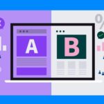
Explore more content-type formatting in this side-by-side format comparison.
6. Optimize for Emotion and Clarity
Visuals should make people feel something—even if it’s just curiosity.
Ways to do that:
- Use expressive imagery—faces, reactions, relatable visuals
- Highlight emotional benefits—not just features or facts
- Avoid overdesigning—simplicity increases comprehension
- Reinforce emotion through your color choices (warm tones = trust, cool tones = calm, etc.)
And remember: clear > clever. If your audience doesn’t get it instantly, they’ll keep scrolling.
7. Templates Save Time—And Keep You On-Brand
Templates are your best friend if you want to scale content without sacrificing quality.
The right templates help you:
- Maintain visual structure
- Apply consistent spacing and typography
- Speed up production and feedback loops
- Hand off design tasks with less risk of error
I’ve created and tested dozens of templates across campaigns. My favorites for time-saving and visual consistency are shared in this design template toolkit.
8. Tools That Help Me Build Visuals Faster
Great visuals don’t require complicated software. I use these tools regularly to streamline my workflow:
- Canva Pro – Fast, intuitive, brand kits, animations
- Figma – Advanced layout planning and prototyping
- Remove.bg – Easy background removal for layered designs
- Unsplash – High-quality free images that feel authentic
- Meta Business Suite – Content scheduling and previews
Want the full breakdown of what I use and why? It’s all in my post on the best tools for social media design.
Final Thought: Visuals Are Not Optional—They’re Essential
Instagram and Facebook thrive on visuals. If your content doesn’t look intentional, clear, and branded, it risks getting ignored—no matter how valuable the message.
Good design builds trust. Great design gets results.
So next time you’re about to post, ask yourself:
- Does this reflect my brand?
- Is it formatted for mobile and optimized for the feed?
- Does it guide the viewer toward action?
When the answer is yes across the board—you’re ready to publish.Want to see which types of visuals actually drive engagement? Start here: Boost engagement through smart post design