Running Google Ads without a strong landing page is like running a marathon in flip-flops. You might move forward, but it’s going to be slow, clunky, and painful.
If your ad campaigns are getting clicks but no conversions, your landing page might be the problem. Let’s fix that.
In this guide, I’ll walk you through how I optimize landing pages for better performance in Google Ads campaigns—backed by experience, not just theory.
What You’ll Learn:
- What a good landing page looks like (and what it avoids)
- Must-have elements for trust and conversions
- Tips to improve load speed, message clarity, and call-to-action placement
- How to match your landing page with your ad
- Mistakes that send traffic running
- Related links for campaign setup and tracking
1. Your Landing Page = Your Closer
Think of your Google Ad as the handshake. The landing page is the pitch—and the close.
If the page doesn’t deliver on the ad’s promise, users bounce. Fast. You pay for the click, but get no return.
That’s why every landing page I build (or review) has one job: turn curiosity into action.
2. Keep It Focused: One Page, One Goal
No menus. No distractions. No rabbit holes.
Each Google Ads landing page should have:
- One offer
- One headline
- One primary call-to-action
Avoid sending traffic to your homepage unless you want users to wander. Create dedicated pages for each campaign or offer.
Need help organizing campaign types and goals? This guide breaks down the setup.
3. Match the Message (AKA Message Continuity)
If your ad says “Get a Free Roof Inspection,” your landing page should not start with “Welcome to Our Home Improvement Blog.”
That mismatch confuses users—and confuses Google. And confused people don’t convert.
Ad: “25% Off Invisalign – Book a Free Consult Today”
Page Headline: “Book Your Free Invisalign Consultation & Save 25%”
Keep the keywords, tone, and offer consistent from ad to landing page. It improves Quality Score and trust.
4. Speed Matters (No One Waits Anymore)
If your page takes longer than 3 seconds to load on mobile, most users are already gone.
Use tools like:
- PageSpeed Insights
- GTmetrix
Quick wins:
- Compress your images
- Minimize scripts and animations
- Use fast hosting (seriously, it matters)
You spend money getting clicks—don’t lose them to slow loading.
5. Structure That Converts (Don’t Overthink It)
A good landing page doesn’t need to be clever. It needs to be clear.
Here’s a high-converting layout I use often:
Headline
Call out the benefit or result.
“Get a Custom Logo in 24 Hours – 100% Satisfaction Guaranteed”
Subheadline
Add context or urgency.
“Includes 3 Design Revisions & Dedicated Designer”
Form or CTA
Simple, above the fold, with a strong button.
“Start My Design” or “Claim Free Quote”
Social Proof
Show logos, testimonials, or stats that build trust.
“Over 1,200 satisfied clients” or “4.9 ★ Google Rating”
Pain → Solution Section
Brief paragraph explaining the value.
“Struggling to stand out? Our logos help you look pro fast.”
CTA (again)
Repeat the ask—now they’re ready.
6. Make Your CTA Obvious (and Clickable)
The Call-to-Action should:
- Be visible without scrolling
- Use active, benefit-driven language
- Stand out visually
Examples that work:
- “Get My Free Quote”
- “Schedule Your Demo”
- “Start My Free Trial”
Avoid the vague ones:
- “Submit”
- “Click Here”
- “Learn More” (unless it actually goes to more content)
Pair your CTA with form tracking. If you’re not measuring this, here’s how to set up conversion tracking.
7. Add Trust Builders (Without Being Pushy)
People need to trust you fast. They’re not looking to make a new friend—they want a solution.
Use:
- Reviews and testimonials (with names/photos if possible)
- Guarantees (money-back, satisfaction, etc.)
- Security badges or “We don’t spam” labels
- Real business info (location, phone, etc.)
This helps you build credibility before users bounce.
8. Mobile First. Always.
More than 60% of Google Ads traffic comes from mobile. If your page looks like a tiny desktop version on a phone… good luck.
Mobile best practices:
- Use big buttons
- Use short forms (2–3 fields max)
- Avoid long blocks of text
- Make CTAs thumb-friendly
Need a sanity check? Load your page on your own phone. If you wouldn’t fill out the form yourself, fix it.
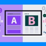
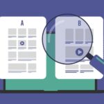
9. Test One Change at a Time
Landing page optimization isn’t a guessing game—it’s testing.
Use tools like:
- Google Optimize
- Unbounce A/B testing
- VWO (if you’re fancy)
Test things like:
- Headline variations
- CTA wording or button color
- Long vs. short forms
- Different trust elements (badges, testimonials)
Only change one thing at a time so you know what actually improved results.
10. Don’t Ignore Post-Click Behavior
Once someone fills out a form or makes a purchase, what happens next?
A proper thank-you page can:
- Confirm their action worked
- Offer next steps
- Help track conversions accurately
- Boost retention by adding a personal touch
Bonus tip: redirect to a thank-you URL so Google Ads can track the conversion cleanly.
Clicks Are Expensive. Don’t Waste Them.
Every click you pay for has the potential to convert—if your landing page is ready to seal the deal.
Keep it focused. Keep it fast. Make your offer clear and your CTA even clearer.
Pair great ad copy with a dialed-in landing page and you’ve got a winning combo. If you’re just starting out or need help with the full ad setup, this guide walks you through it.
Struggling with bounce rates or low conversions? Check your ad copy too—it might be setting the wrong expectations.