If you’re putting great content into your posts but not getting traction, the issue might not be your message—it could be how it looks.
In my experience as a digital marketer, design choices like color, typography, and layout are often the silent deal-breakers. The wrong combination can make a post feel cluttered, off-brand, or hard to read. The right one? It stops the scroll, draws attention, and supports the story you’re trying to tell.
This post will break down:
- How color, font, and layout affect your social performance
- What combinations to avoid (and why they fail)
- Simple design principles that elevate every post
- Tools and tips for applying these design elements consistently
Design isn’t about making something “pretty.” It’s about making sure your message gets seen, understood, and acted on.
1. Why Visual Design Isn’t Optional on Social Media

Before anyone reads your caption or clicks your CTA, they experience your visual hierarchy. In less than a second, they decide whether your post is worth their time.
Your post design needs to:
- Catch the eye without overwhelming
- Communicate the message without confusion
- Reinforce your brand without being repetitive
Color, font, and layout work together to do all of the above. If one is off, the rest struggle to carry the load.
Want proof? See how these principles apply in scroll-stopping graphics that work.
2. Color: Set the Mood and Highlight the Message
Color is the first thing people notice—and often the reason they stop scrolling.
Use Color to:
- Evoke emotion (blue = calm/trust, red = urgency/action, yellow = optimism)
- Reinforce your brand with consistent palettes
- Guide attention to key elements like buttons, headlines, or offers
What to Avoid:
- Too many competing colors (it creates noise, not contrast)
- Bright-on-bright text combos (e.g., neon green on white = instant bounce)
- Random color usage that doesn’t align with your brand voice
I recommend 2 primary and 1–2 accent colors max. If you’re unsure, try a tool like Coolors or Adobe Color to build a palette that feels intentional.
You can also check out some of my preferred template designs that use color correctly.
3. Fonts: Make Your Message Readable (and Memorable)
Typography gets overlooked—but it shouldn’t. It’s your visual tone of voice.
Choose Fonts That:
- Are easy to read, especially on mobile
- Align with your brand’s personality (fun, formal, techy, elegant)
- Offer clear hierarchy—different weights and sizes to structure info
Font Combos That Work:
- Serif + sans serif
- Bold headline font + clean body font
- One typeface with multiple weights for simplicity
Avoid novelty fonts for main text. If it looks like a wedding invitation or a graffiti wall, it’s probably not a fit for social.
Need help picking a font? Google Fonts is a solid place to start—and it integrates easily with most design tools.
4. Layout: Structure That Supports Your Message
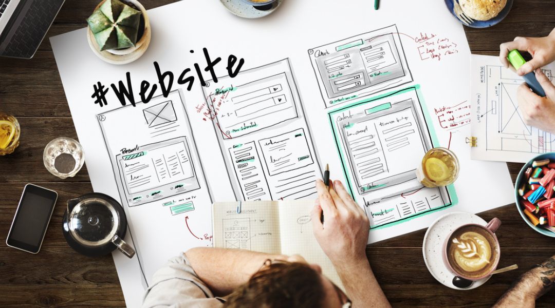
Layout is how you organize content inside the post. A strong layout makes a post digestible. A bad one? It buries the message.
Good Layouts:
- Use spacing to separate elements (no crammed content)
- Follow the “Z” or “F” pattern to guide the eye
- Highlight a clear visual path from headline → image → CTA
Avoid These Mistakes:
- Floating text with no alignment
- Centering everything (feels amateur and lacks flow)
- Skipping margins or padding—your design needs breathing room
For examples of how layout supports conversion, look into my post on designing posts that convert.
5. Combine All Three for Better Engagement
Design isn’t just one piece—it’s how color, font, and layout work together.
For example:
- A bold red CTA button stands out more when paired with soft background tones
- A structured layout with intentional spacing makes your serif headline feel elegant, not old-fashioned
- A playful font looks more polished when used sparingly and balanced with clean sans serif text
Start small. Audit your last five posts. Are your colors consistent? Are your fonts readable? Is the layout helping or hurting the message?
These design choices are where your brand shows up visually—make sure they’re sending the right signals.
Want a shortcut? My brand consistency guide will help you align everything visually.
6. Tools I Use to Nail Design Without Overthinking It
You don’t need Photoshop to get this right. Here are my everyday design tools:
- Canva Pro – Great for pre-made font and color pairings
- Figma – My go-to for layout prototyping and feedback loops
- Coolors.co – Easy palette generator
- FontPair.co – Helps pick matching font combinations
- Meta Business Suite – Lets me preview how designs look before publishing
You can explore more of my go-to tools in this post design toolkit.
7. Keep Testing Until It Works
Every audience responds differently to visual cues. That’s why I test:
- Font sizes across devices
- CTA button placement
- Color combinations in carousels
- Layouts for story vs. feed vs. ad formats
And no, I don’t always get it right on the first try. But by tracking what works and building on that, the process becomes faster and more effective over time.
For inspiration on adapting your design across platforms, read this breakdown of what works on Instagram vs. Facebook.
Final Thought: Your Message Deserves Good Design

Design isn’t fluff—it’s function. Your best content will fall flat if the visuals don’t support it.
When you align your color, typography, and layout intentionally, you create social posts that people not only notice—but act on.
So take the time to get your design system in place. Start small. Stay consistent. And keep adjusting based on performance.Need help putting it all together visually? Start with this guide to engaging design strategies.