Let’s be honest: there’s nothing more disappointing than spending hours on a report that no one reads. Maybe it gets a skim. Maybe someone highlights a typo and moves on. But if your social performance summaries aren’t influencing strategy, budget, or behavior—why are you even building them?
Over the years, I’ve built and rebuilt dozens of these. Some worked beautifully, others… not so much. What I’ve learned? A great report isn’t about more data—it’s about better storytelling with purpose. Below, I’m sharing how I build performance summaries that do more than collect digital dust.
What You’ll Take Away
- How to make reporting meaningful, not just routine
- The exact structure I use in client and internal updates
- My method for turning data into strategy
- Reporting tools that save me time and energy
- Ways to tailor your summary for different stakeholders
1. Reports Should Say Something — Not Everything

When I create a report, I treat it like a short narrative. What’s the headline of the month? Did a test work? Was there a sudden dip? My goal is simple: offer insight, not just information.
A basic summary is fine, but I go deeper. What shifted, and why? A metric went up—great. But what action do I take next? That’s the real question.
2. Start with Goals (No One Likes a Wandering Report)
If your summary isn’t tied to a specific goal, it’s just a list. That’s not helpful.
Every report I create is framed around clear, achievable objectives. Ideally, those goals are SMART (specific, measurable, attainable, relevant, time-bound), but let’s keep it real—sometimes I work with “make the client happy” as my north star. Even then, I define what success looks like.
For example:
- Brand awareness? I’ll track reach, impressions, and post shares.
- Traffic? I focus on link clicks and conversions.
- Engagement? That’s where comments, saves, and replies shine.
Your goals shape the rest. Don’t skip this step.
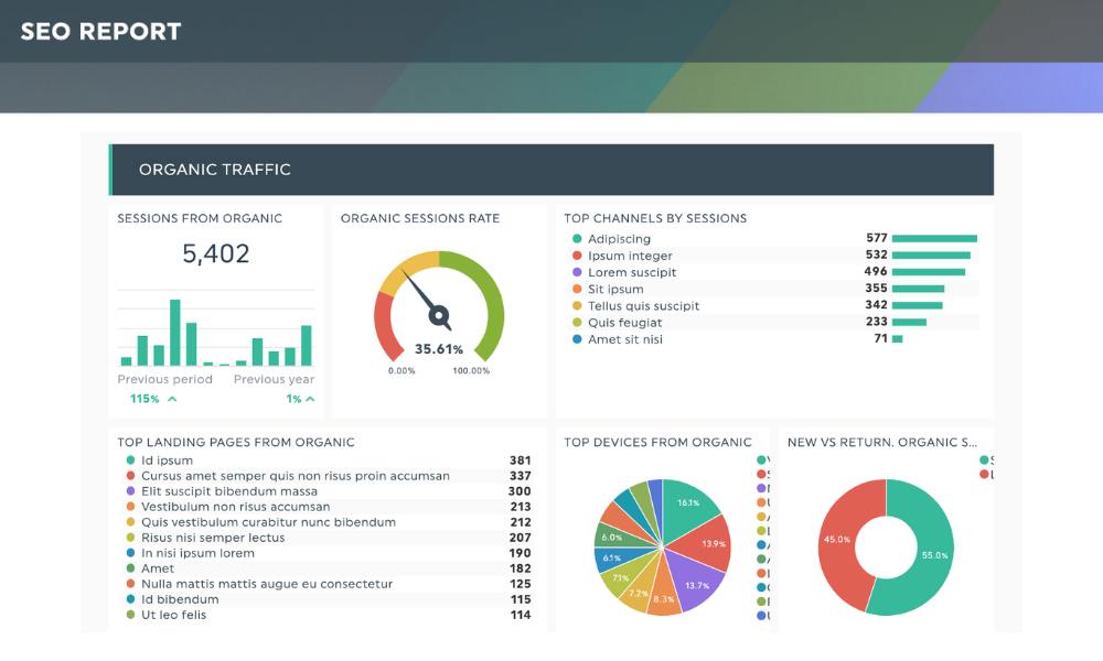
3. Not All Metrics Deserve a Spot in Your Slide Deck
Some data points make you look busy. Others make you look smart. Know the difference.
I’ve seen reports loaded with likes and emoji reactions that mean nothing. These numbers might look good in isolation, but they rarely help with big-picture planning. Here are the ones I always focus on:
- Engagement rate – Tells me if content resonates
- Click-through rate – Helps with traffic performance
- Follower growth – A solid directional indicator
- Conversions or leads – If tracked, goldmine
- Reach – Useful, but only in context
Want a solid reference? This post outlines which social metrics truly reflect performance.
4. Structure Matters (A Lot)
If your data is scattered across a dozen screenshots and charts, your message gets lost.
Here’s my go-to structure:
- Quick Summary – One line. One paragraph max.
- Wins & What Worked – Posts, tactics, channels.
- Challenges – Campaigns that underdelivered or tested poorly.
- Key Numbers – Broken down by channel or campaign.
- Next Steps – A preview of planned changes or tests.
I sometimes add a slide or section for community sentiment if I’ve been watching comments or DMs closely. When it fits, I refer back to my monthly checklist to avoid missing a beat.
5. Tools I Actually Use (And Still Like)

I won’t bore you with a huge list of tools. Here’s what I keep in rotation:
- Meta Business Suite – Good for Facebook and Instagram (when it behaves).
- Google Analytics 4 – I use it to measure behavior after clicks.
- Later – It gives me exportable reports with minimal hair-pulling.
And yes, sometimes I export raw numbers into my own Google Sheet. It’s not glamorous, but it lets me slice the data how I want. One handy template goes a long way. If you’re curious about other options, I’ve explored some solid ones in this guide.
6. Data Is Just the Start — Insights Seal the Deal
This part? It’s where reports go from “meh” to meaningful.
I always interpret the data. What changed? What’s likely causing the spike—or the drop? Is it seasonal? Is it timing? Did we run ads? Even better—how can we repeat the good stuff?
This isn’t about being a data scientist. It’s about asking simple, smart questions. And honestly, if you’re unsure where to start, my advice is to check out this breakdown on turning analytics into insights.
7. Adjust for Your Audience (Yes, It’s More Work — But Worth It)
Executives don’t want the same report I’d send to a social team. Clients don’t want internal test data. I create modular sections so I can swap based on who’s reading.
- C-Suite? Start with wins, losses, and next steps. Charts optional.
- Social team? Show testing, post breakdowns, new formats.
- Marketing leads? Highlight traffic and conversions.
One template, multiple use cases. Saves me hours every month.
8. Keep It Predictable, but Adapt When Needed
Consistency helps. I send reports at the same time each month and use similar formats, but I also allow myself to tweak based on what’s happening. For example, if a major campaign just launched, I’ll add a one-pager on early results.
Flexibility keeps things human. Predictability keeps things organized. You want both.
If you’re struggling with consistency, this performance checklist has helped me keep things on track without reinventing the wheel.
9. Use Your Report to Guide Strategy — Not Just Reflect It
What’s the point of all this if I’m not applying it?
Every report I write ends with “Here’s what we’re changing.” Whether it’s doubling down on carousel posts or shifting budgets from Facebook to LinkedIn, I draw a line between insights and action. That’s how I avoid rinse-repeat reporting.
Want a solid example of what this looks like in action? I break it down further in my post on data-driven strategy.
Final Thoughts: Your Report Should Work Harder Than You Do
If your monthly summary doesn’t shape your next strategy, it’s just decoration. A well-structured, purpose-first report can win budgets, validate experiments, and spark smart pivots. So keep it simple. Keep it strategic. And maybe, just maybe, add a little humor when someone forgets what “reach” means again.
: