Dashboards. Love them or hate them, they’re everywhere. Every tool promises “data at your fingertips,” but let’s be real—most dashboards are more like data graveyards. Endless metrics. No context. And worse, no decisions being made.
If you’ve ever stared at a dashboard and thought, “Cool… but now what?”—this guide is for you.
In this post, I’ll walk through how I build KPI dashboards that actually help teams make smarter, faster, and more confident decisions. Not just track numbers.
What You’ll Learn in This Guide
- What separates a KPI dashboard from a data dump
- How I choose which KPIs to show (and which to hide)
- Tools I use to build dashboards for clients and teams
- Layout tips that make dashboards scannable and decision-ready
- The biggest mistakes I see—and how to avoid them
- How to keep dashboards useful long after launch
First: What a KPI Dashboard Is (and Isn’t)
Let’s start with what it’s not:
- It’s not a list of every metric you can think of
- It’s not a pretty chart no one understands
- It’s not a static report that dies after one meeting
A real KPI dashboard is:
- A living view of your most important performance indicators
- Built for decision-making, not just status updates
- Tied to business goals, not just marketing activity
If your team can’t answer “what changed and what should we do about it?”—then it’s not a dashboard. It’s decoration.
How I Decide What Goes Into a Dashboard
Here’s how I build dashboards that stay useful over time:
Step 1: Start With the Goal
Ask: What decision will this dashboard support?
- If it’s for leadership: focus on ROI, growth, and budget efficiency
- If it’s for the marketing team: focus on channel performance, funnel bottlenecks, campaign impact
- If it’s for sales: prioritize SQLs, lead sources, conversion rate
Different teams need different data stories.
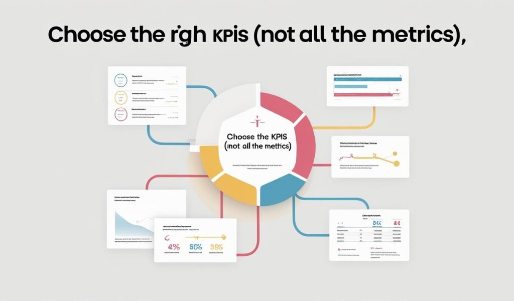
Step 2: Choose the Right KPIs (Not All the Metrics)
More is not better. Better is better.
I typically include:
- 5–7 primary KPIs tied to the team’s goal
- A few supporting metrics for context (if needed)
- Trends vs targets (performance over time vs. goal line)
Examples of smart KPI pairings:
- Traffic + conversion rate (volume + effectiveness)
- Cost per lead + revenue per lead (efficiency + return)
- Churn rate + customer LTV (retention + value)
Need help choosing the right KPIs? Use my KPI-setting guide for a full breakdown.
Step 3: Make It Scannable (Because No One Wants to Read a Spreadsheet)
When building dashboards, clarity beats cleverness.
Layout tips I follow:
- Use horizontal rows or cards to separate sections (top KPIs, channel data, campaign breakdowns)
- Stick to simple visuals (line charts, bar graphs, and tables—no pie charts unless it’s dessert)
- Color code: green = good, red = needs attention, yellow = something changed
- Add callouts or “notes” for big shifts or anomalies
Think of it like this: if someone glances at the dashboard for 2 minutes, they should know what’s working and what’s not.
Tools I Use to Build KPI Dashboards
You don’t need to spend a fortune. You just need the right tools for the size of your team and complexity of your data.
Here are the ones I use most often:
Looker Studio (formerly Google Data Studio)

- Best for: Free, flexible dashboarding
- Connects with: GA4, Google Sheets, BigQuery, and more
- Why I use it: Great for marketing teams who want easy sharing and live data
HubSpot Reports
- Best for: Marketing + sales KPIs in one place
- Connects with: CRM, emails, landing pages, deals
- Why I use it: Solid option for lead gen teams who need CRM visibility baked in
Power BI / Tableau
- Best for: Large orgs or complex data environments
- Why I use it: Powerful visualization, great for cross-department insights
- Downside: Heavier setup and learning curve
Supermetrics (for integration)
- Best for: Pulling data into Looker Studio, Sheets, or Excel
- Why I use it: Automates data pulls from ads, email, CRM, and more
Need help deciding which tool’s right for you? I break down top tracking tools in this article.
What a Great KPI Dashboard Actually Includes
I build dashboards with three essential layers:
1. Top-Level KPIs
These are your “health check” metrics:
- Traffic
- Leads or signups
- Revenue
- Conversion rates
- Cost per lead or acquisition
2. Performance Trends
This is where you see what’s improving or declining:
- Week-over-week or month-over-month comparisons
- Campaign performance over time
- Channel breakdowns
3. Actionable Insights
Data without action is just decoration. I include:
- Notes on spikes or dips
- Anomalies to review
- Suggested actions (e.g., pause underperforming campaigns, increase spend on high-ROAS ads)
Dashboards should make action obvious—even if that action is “dig deeper.”
Mistakes I See (and How to Avoid Them)
Mistake 1: Too Many Metrics
The dashboard turns into a wall of charts. Nobody uses it.
Fix: Stick to 5–7 KPIs max. Make deeper metrics available but optional.
Mistake 2: No Ownership
Everyone builds dashboards. No one maintains them.
Fix: Assign one person or team to update, review, and adjust monthly.
Mistake 3: Data Without Context
The numbers are there—but no one knows what’s good or bad.
Fix: Include targets, benchmarks, or previous period comparisons.
Mistake 4: One Dashboard for Everyone
Your CMO and your paid media manager don’t need the same view.
Fix: Customize dashboards by role or team. One size does not fit all.
How I Keep Dashboards Useful (After the First Week)
Most dashboards get built once… and then ignored forever. Here’s how I keep them alive and actionable:
- Monthly reviews: Walk through KPIs with the team
- Quarterly audits: Are we still tracking the right things?
- Feedback loops: Ask the team what data they actually use
- Annotations: Add quick notes when context changes (e.g., platform updates, budget shifts)
And yes, if a dashboard stops helping you decide or act, it needs to change. Not sit there collecting digital dust.
Final Thoughts
A KPI dashboard isn’t just a report—it’s your strategy, visualized. Built right, it becomes the center of every conversation: what’s working, what’s not, and where to go next.
If you’re building dashboards for the first time (or cleaning up ones that haven’t been touched since last quarter), start here:
- One goal
- Five KPIs
- One simple layout
- One tool your team will actually use
And remember: dashboards don’t need to be beautiful. They need to be useful.